


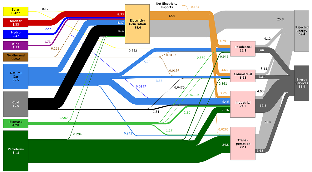
Infographic: This 2014 energy flow chart was released by Lawrence Livermore National Laboratory. It details the sources of energy production, how Americans are using energy and how much waste exists.
Americans’ energy use continued to grow slowly in 2014, fueled by increases in the use of natural gas, wind and solar, according to the most recent energy flow charts released by Lawrence Livermore National Laboratory.

Each year, the Laboratory releases charts that illustrate the nation’s consumption and use of energy. Overall, Americans used 0.9 quadrillion (quads) British thermal units (BTUs) more in 2014 than the previous year, an increase of about 1 percent.
The Laboratory also released a companion chart illustrating the nation’s energy-related carbon dioxide emissions. Americans’ carbon dioxide emissions increased, but only barely, to 5,410 million metric tons from 5,390 million metric tons in 2013. However, carbon emissions from coal and petroleum declined, while emissions from natural gas made up the difference. Overall, the carbon intensity of the American energy economy is decreasing.
Petroleum use was decreased by 1 percent due mainly to lower use in the industrial sector. Much of that energy has been replaced by natural gas.
“American manufacturers have gained confidence that natural gas prices will stay low for the long term, and have invested in equipment to switch from oil to natural gas feedstocks and fuels,” said A.J. Simon , an LLNL energy group leader.
Overall natural gas use increased by 0.9 quads. The growing economy spurred demand in the commercial sector, and use was up in the transportation sector because natural gas is used to power natural gas pipelines, and pipeline utilization has been on the rise for the past decade.
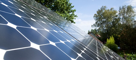
Solar energy use jumped dramatically by 33 percent from .32 quadrillion BTUs, or quads, in 2013 to .427 quads in 2014. Simon attributes the change to an unprecedented solar industry expansion coupled to low global prices for panels and innovative financing for homes and businesses. Both utility-scale solar (which feeds the power grid directly) and rooftop solar experienced rapid growth.
Wind energy was up again by 8 percent, growing from 1.6 quads to 1.73 quads. The pace of wind energy deployment slowed considerably from 2012 to 2014. Hydroelectricity production declined by almost 4 percent due to the continued drought in California, Simon said
The majority of energy use in 2014 was used for electricity generation (38.4 quads), followed by transportation, industrial, residential and commercial. Energy use in the residential, commercial transportation sectors all increased slightly while the industrial sector did not fluctuate from 2013 use.
Rejected energy increased to 59.4 quads in 2014, from 59 in 2013, rising in proportion to the total energy consumed. “Not all of the energy that we consume is put to use,” Simon explained. “Heat you feel when you put your hand on your water heater and the warm exhaust from your car’s tailpipe are examples of rejected energy.” Comparing energy services to rejected energy gives a rough estimate of each sector’s energy efficiency.
Reference(s):
Infographic Credit: Lawrence Livermore National Laboratory (LLNL) produced the first diagrams illustrating U.S. national commodity use in the mid-1970s. The most widely recognized of these charts is the U.S. energy flow chart. LLNL has also published charts depicting carbon (or carbon dioxide potential) flow and water flow at the national level as well as energy, carbon, and water flows at the international, state, municipal, and organizational (e.g., Air Force) level. Flow charts, also referred to as Sankey Diagrams, are single-page references that contain quantitative data about resource, commodity, and byproduct flows in a graphical form. These flow charts help scientists, analysts, and other decision makers to visualize the complex interrelationships involved in managing our nation’s resources.
Story: American energy use up slightly, carbon emissions almost unchanged | DOE/Lawrence Livermore National Laboratory — May 20, 2015


Comments